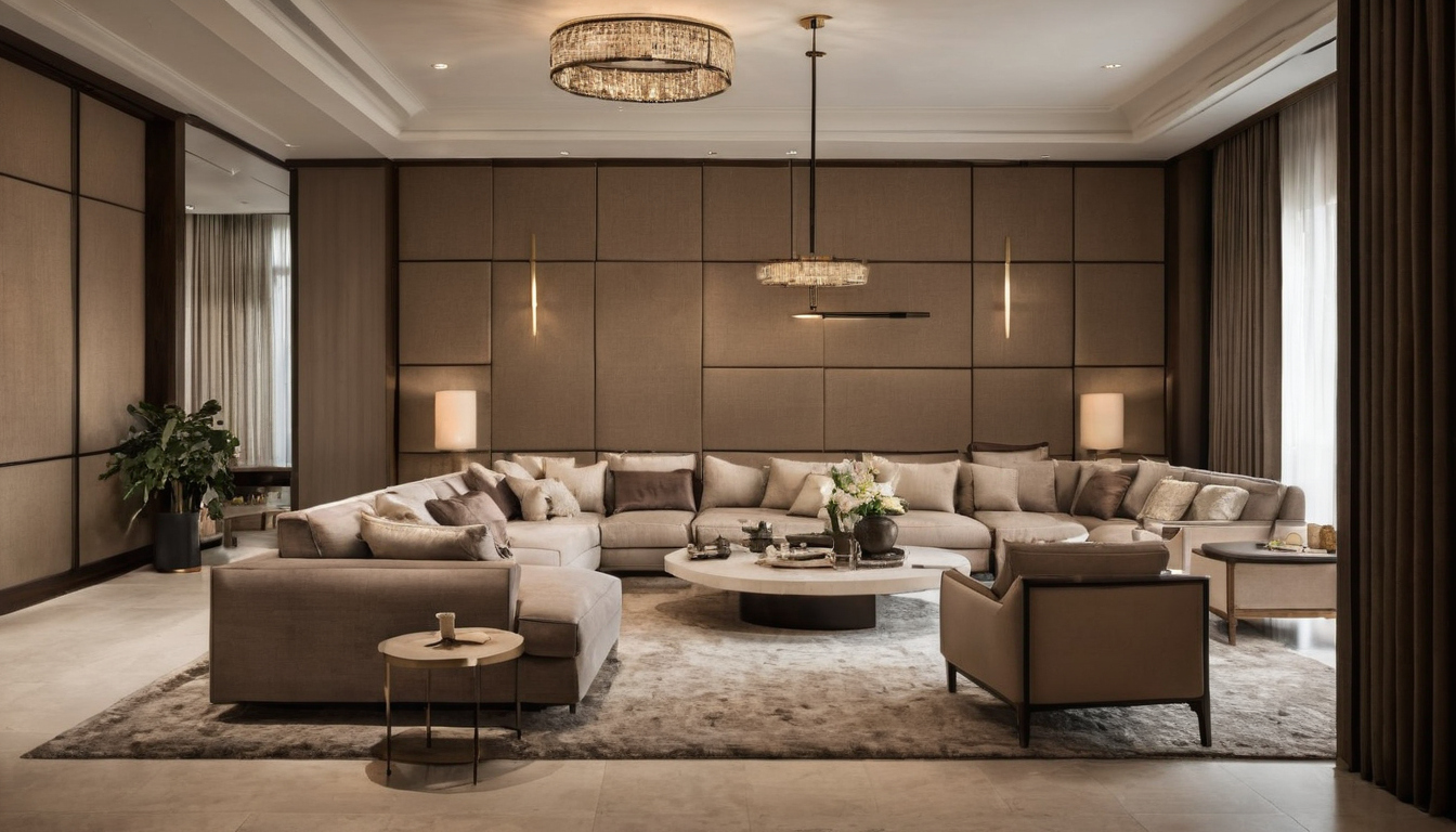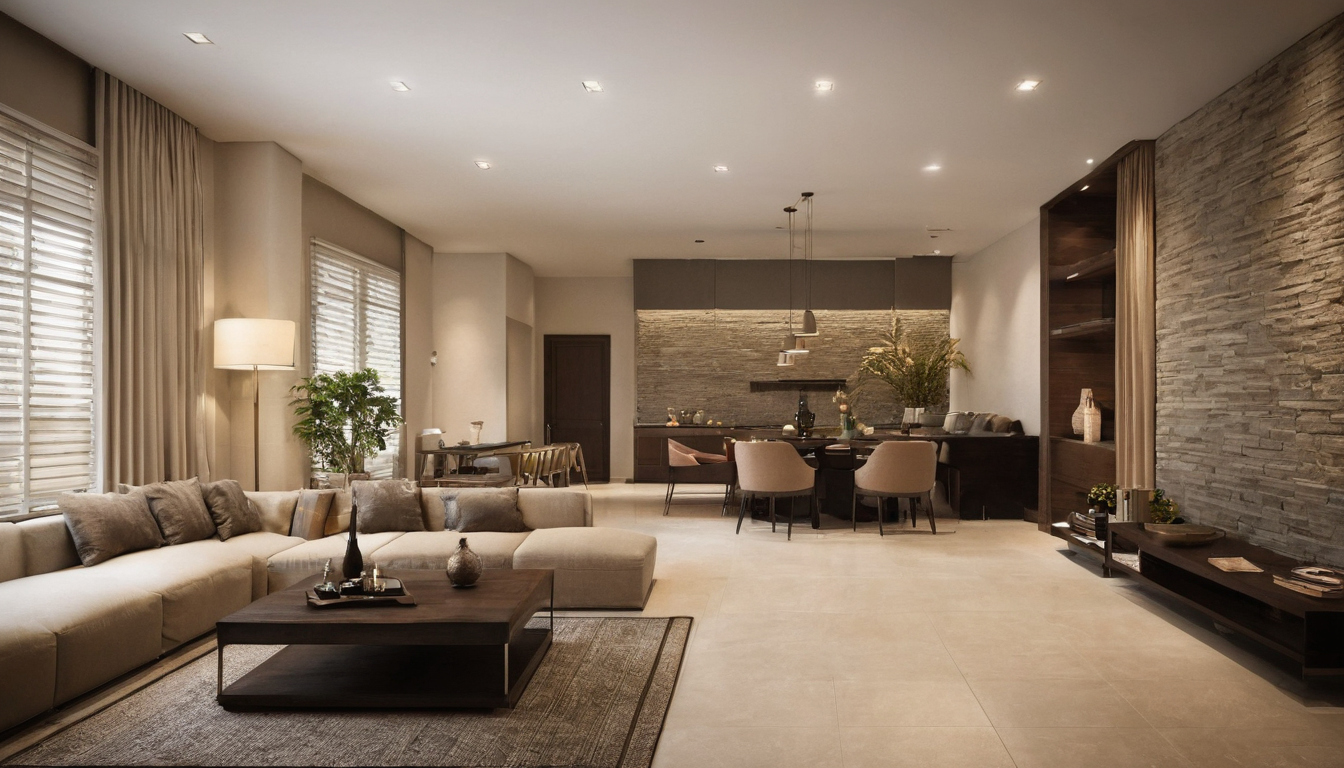
Choosing color is often described as finding a favorite shade. In a room, that shade has to work with daylight, flooring, furniture, and the adjoining spaces. The useful question is what role the color should play: quiet background, warm accent, or a strong focal point.
Start with the fixed elements
Before opening a paint chart, list what will stay: floors, tile, cabinetry, major upholstery, and large pieces of art. Their undertones set the context. A warm off-white may connect with honey-colored wood, while a cooler neutral may sharpen its contrast. Hold samples directly against these materials rather than judging them alone.
Light changes color. Place a generous sample on more than one wall and look at it morning and evening. If a color becomes too intense in direct sun or too dull under lamps, adjust the shade or its location before committing to the whole room.
Give each color a job
A restrained palette can use a main wall tone, a supporting neutral, and one accent. The proportions need not follow a formula. A small bedroom can carry a deep wall color if the lighting and textiles balance it; a large living room can feel rich with mostly pale surfaces and a few concentrated notes.
Repeat an accent selectively. A cushion, artwork, and ceramic object in related tones can link a room, but exact matching often feels forced. Varying texture makes a simple palette more interesting than adding more colors for their own sake.
Use furniture to bridge rooms
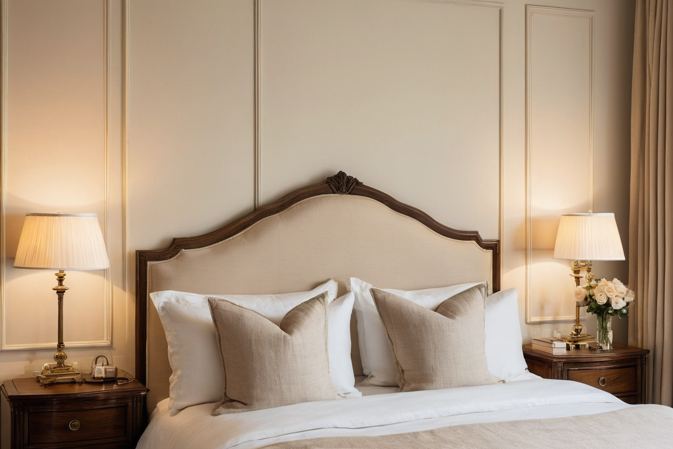
Furniture can connect color schemes across a home. Timber, upholstery, and metal finishes are visible from room to room, so compare them as a group. In a bedroom, a painted wall can provide a calm backdrop for pieces such as classic Italian bedroom furniture, where carved detail and finish already carry visual weight. That is a style reference; the room still needs its own balance of light, scale, and storage.
In a more minimal room, color can sit in a single chair or textile instead. The common principle is to let the furniture and the walls share attention rather than compete for it.
Edit in the actual space
Gather material samples, fabrics, and paint cards together. Move them around the room and remove anything that introduces a new undertone without a reason. Check the view from the doorway and the place where someone normally sits. If the palette works from both positions, it is less likely to depend on a carefully framed photograph.
Color can make a home feel personal without becoming loud. Its success lies in relationships: one shade answering another, a material adding texture, and enough quiet surface to let the whole composition breathe.