Orange can seem like a demanding color until it is brought closer to clay, rust, and baked earth. Burnt orange and terracotta have depth as well as warmth. They can make a pale room feel welcoming, especially when used beside the quieter tones of stone and timber. The key is to decide what the color should do before deciding how much of it to use.
Begin with an undertone, not a name
Terracotta can lean pink, red, brown, or ocher. Two samples called by the same name may look unrelated once they meet the floor. Start with what is already fixed in the room: the wood, tile, stone, or upholstery that will remain. A redder clay tone can work with warm timber, while a brownish rust may sit more comfortably beside beige stone. Hold samples against those surfaces at different times of day.
A small painted card is useful for comparison, but a larger sample shows how a wall color behaves across a corner. Daylight can sharpen orange; warm evening light can make it richer. If the shade feels too vivid, look for a dustier version before reducing every other color to gray.
Let pale materials create breathing room
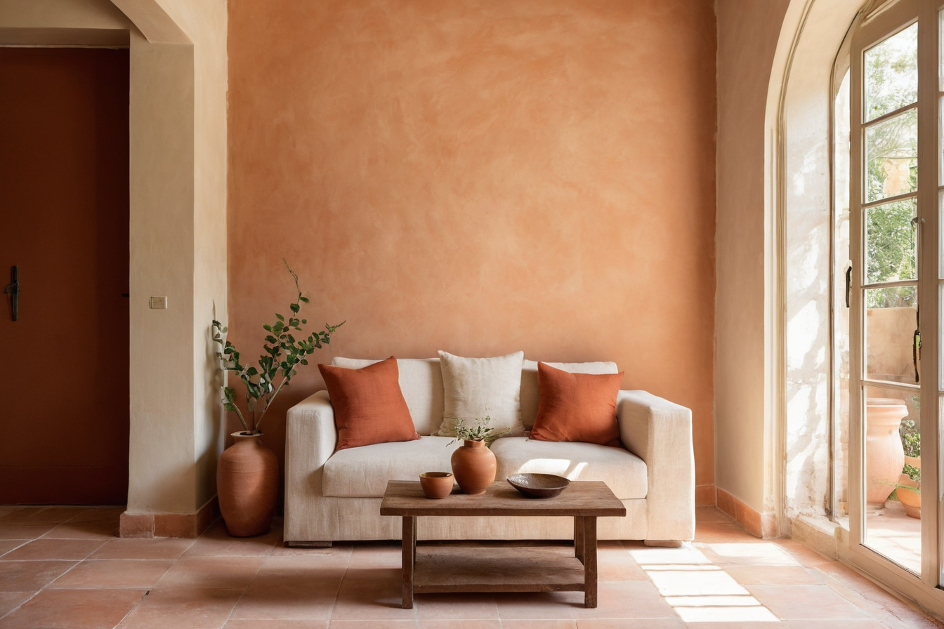
Pale limestone tones, warm off-white plaster, and lightly grained wood give terracotta something calm to play against. The contrast is gentle, yet the orange becomes easier to read. A cream sofa beside a clay-colored wall, for instance, creates a different mood from orange upholstery against white paint. Neither arrangement is a fixed recipe; each changes where the eye rests.
Texture keeps the palette from flattening. Matte ceramic, woven linen, timber grain, and softly finished stone catch light in different ways. If several of those materials are present, limit glossy accents so the room does not feel overworked.
Choose the scale of the gesture
For a modest first step, use one textile, ceramic piece, or artwork with a clay note and repeat the tone once elsewhere. A rust-colored armchair can become the anchor in a neutral sitting room. A full wall is a stronger decision: it works best when the furniture has enough visual weight to sit beside it and the adjoining surfaces remain quieter.
There is no requirement to match every orange exactly. Related shades can add depth, provided they share a muted character. Keep a sample of each item together; this makes accidental clashes easier to spot before ordering.
In a room with several doors or open connections, consider where the orange is visible from the next space. A painted wall that looks balanced straight on may become a bright strip from the corridor. Place a sample on that sightline as well. If the color is carried instead by upholstery, note how much of it appears when the room is seen from outside. This small check helps the palette feel connected rather than abrupt.
Balance warmth with shape and light
Burnt orange can feel enveloping when paired only with dark, heavy pieces. Counter it with a slim table, a pale rug, or furniture that allows some floor to remain visible. Greenery, charcoal, or deep brown can add a small grounding note without taking over the scheme.
Lighting matters because orange reflects warmth back into a room. Test lamps in the evening and avoid judging the color under a single harsh ceiling source. Soft, layered light reveals the grain of wood and the variation in stone as well as the color itself.
The finished palette should feel lived in, not staged around a trend. When terracotta has a clear role and the surrounding materials remain visible, it gives a room energy while keeping its sense of ease.